

Importance of contrast.
- Matt Powell
- 1 day ago
- 4 min read
Back in the late 1990s I was studying graphic design for my A-levels. My lecturer John Llewellyn was a great teacher. He was calm passionate and talented. He was mild mannered but principled and he commanded respect by his consistent example.
One of John’s principles was that he would champion excellence.
He seemed devoid of inflated ego. He was thrilled if students produced works superior to his own.I can never recall him appearing threatened or uncomfortable when a student produce something exceptional. In fact he would encourage us to broaden our horizons and seek out positive influence.
He just wanted us to get better!
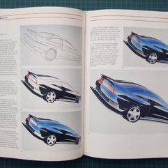
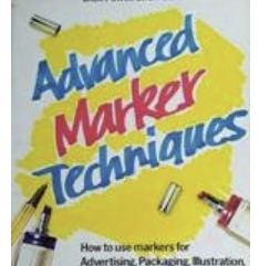
Around 1997 we were learning how to illustrate with spirit markers. These wide tipped pens were expensive, required skilled application and were the weapon of choice for generations of car designers. I brought a book by a famous product designer with hints and tips on how to use the pens but I still craved more refinement and fineness.


Ultimately, I knew I could achieve better results. But I just didn’t know how to get them!
At the time my uncle Stewart was a production engineer at a broadcast electronics company. His company had an industrial design department and Stew set up a meeting for me with Neil the designer principal. Neil was an enigmatic character who drove an old-fashioned mini and wore a sweater with elbow pads. He was shy by my nature and happy in his own company, but he was a design genius and a virtuoso illustrator.

Neil had been trained in marker rendering by the best in the business pininfarina in Italy. He explained to me that he had driven his mini over the Alps to get there and he had learnt his trade from Italy’s finest while working as an intern.
Pininfarina is a fine stylist (design house) which produced beautiful cars such as the Fearrari Testarossa and the Alfa Romeo Spider.


Neil‘s job when there was (from memory) styling the doors of washing machines.
(We all have to start somewhere!)
Neil started with the basics and taught me different ways to hold the marker. He showed me how to maintain a “ wet edge “ to avoid streaks and even taught me how to deconstruct and then they revive the wick of a pen when it appears to be drying out.
He taught me how to simulate reflections and light from tone change and stroke. He Revolutionised my technique! However, Neil‘s lesson that is burned foremost into my memory is the importance of contrast.
To illustrate a sharp edge a useful hint is to apply a fine highlight. To achieve this we would sharpen an expensive pure white pencil and then lay down the finest of lines to simulate light hitting an edge! This would instantly add punch to the visual and add a realism previously missing and only noticed by the viewers subconscious.
Then Neil added the Midas touch.
He explained to me that’s to increase any effective highlights you must include a contrasting low light. With an equally sharp deep black pencil, he would then scribe a deep black line along the same contour as the white.
Strangely, if you did not know it was there you would most likely miss this detail. But its presence lifted the white and sharpened the highlights. It added punch to the render and realism to the overall visual.
These kind of subtleties were simply not taught in the books. You had to witness them at the hand of a virtuoso!

Much like the difference exhibited by a stick in the hand of a skilled drummer. It’s about the feel and the craft. It is about the expression of the artist.
I’ve often compared the presence of low lights to highlights with timing variations in kata. It is often the slow calm of a previous move that can enhance the apparent speed and explosion of the next.
But as I mature as a teacher, I wonder if a better comparison could be drawn on different character types and focus in our dojos?
For me, the relevance of this anecdote to karate is in seeking out a higher authority when we know or feel there is more to be learned and understood. In karate it can often be felt that a student lacked respect or loyalty if they seek insight from another sense of senior.
Thankfully as my inquisitive nature has been consistent in my design, professional and karate studies. My teacher (Mervyn O’Donnell) understood this about me and never discouraged my need to understand nuance and subtlety from those I felt had the midas touch.
Much like Neil taught me detail and finesse in design. I’ve been fortunate to learn significant detail from Dave hazard and Simon Staples over the last couple of decades. I’m grateful for that input advice and inspiration which feeds my work to this day.

While Neil went to Italy to seek a deeper understanding and skill set, Dave and Simon both went to Japan in their youth.
Interestingly, while Neil showed me the techniques I needed for next level visuals. The only way to achieve them was through practice. It was a good 10 years plus until I was deploying highlight and low light without conscious thought on packaging designs.
Similarly, I often only appreciate a finer point or detail now which I learned from one of my karate mentors decades ago!
So what am I trying to say in this article?
Well as I sit here at Bournemouth Beach as my kids play, I realise that when deeply tired from work we must have complete rest. Balance in life is dependent on contrast!
To achieve next level results you need next level instruction Insight and nuance.


Life and karate is about subtlety and nuance. Sometimes these need to be exhibited by others so that you can be inspired for your future work and development.
Not everybody will see or understand the subtleties at play but it is often the smallest contrasts that make the biggest difference.
Next level performance requires next level understanding.
And practice!
I am grateful for the input from my mentors and I’m hungry for more!
Comments